Statcounter

Saturday 20 December 2014

Pierre-Yves Girard at Galerie D'Este.

PIierre-Yves Girard - Écorceur de pruches,
Pierre-Yves Girard - Écorceur de pruches

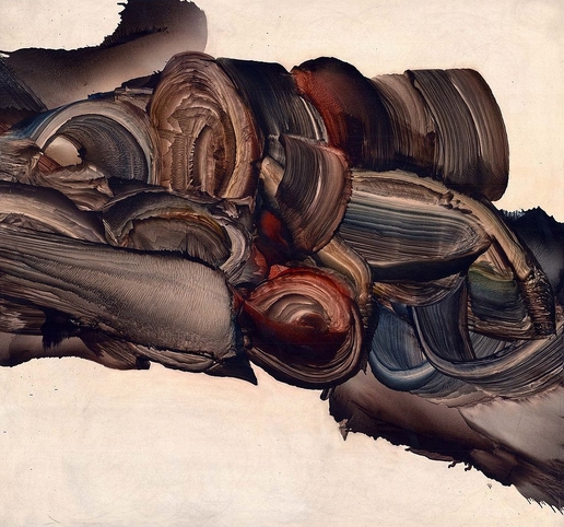
Pierre-Yves Girard's paintings take up the corner of Galerie D'Este's end of year show. A strong and lush brown to blue palette with tinges of blood red circulates and unfolds throughout his swirling oil paintings. A good sense of contracting and releasing torsion in a few, particularly the verticals. The paintings orchestrated on the horizontal lose much of this. Their rendering is looser, the composition less clear. Rather than being dynamic, they tend to thud. This is a bit tragi-comic; a set of convulsions registered as smears that shadow action. But this delicacy, often verging on failure, is damaged by his frequent spattering of black dots that muddy up the negative space around his cautiously manipulated zones. More carefully applied, they might have provided a certain degree of ironic displacement for the central gestures. Instead, they come off as less uncertain and more distracted: too much of too little.

Friday 19 December 2014

Kent Monkman's Urban Res at PFOAC.

Kent Monkman - Red
Kent Monkman - Red

I have to admit that I've always been ambivalent about Kent Monkman's work. That hasn't changed, but I've finally found a way to look at it and not see it as tedious. Monkman, winner of the Hnatyshyn 2014 Prize for excellence in the visual arts and winner of 2014 Indspire Award, has been the poster child (or pin-up girl) for politicized art in the country for awhile. His latest exhibit, Urban Res, at PFOAC displays homoerotic aboriginal youths with tattooed angels, spirit warriors, figures from Picasso and Francis Bacon, all running riot in what appears to be Manitoba. It plays on images of Christian martyrdom and echoes some of Attila Lukacs' earlier work. By coincidence, it also benefits from the imagery of the latest racial fiascoes south of the border to have become the fodder for an orgy of televised and online stupidity. I mention this largely because the sizable volume of writings to accumulate around Monkman tends to replay many of the same underlying moral and political arguments, albeit in more domesticated, if no less pretentious, tones.

Thursday 18 December 2014

Luke Painter's Hither and Thither at Galerie Trois Points.

fantasy_02
Luke Painter - Fantasy 02
There's something too restrained about Luke Painter's ink on paper works displayed at Galerie Trois Points. They manage to be not quite lively enough to be successfully decorative and yet still not quite developed enough to be the backgrounds for a graphic novel. There's not enough atmosphere for either. A sense of expressionistic set design runs throughout the pieces. He even titles one Blue Room (Dark Italics Dr Caligri). It is reminiscent of Weine's classic film (though perhaps more of Laughton's The Night Hunter sets). To up the ante, he sets the work in a slanted frame (thus italic). This underlining of his images points more to what they are missing than to anything else. They don't express much, they just stage it. What results from this is an oddity: spaces without place. They are one liners that run in a vacuum of unlimited time. There's something interesting about that. I can't imagine what it is. That's what's interesting... the not imagining of the image. If, in practice, this often makes them come off like throwaway set designs from a forgettable 80s kids movie (Gardens [Basilius Besler] is reminiscent of some of the sets of Return to Oz) or a no budget dystopian fantasy, it also makes them strangely close to Minimalism. The best summary of the show is probably Fantasy 02 which provides both the overgrown yet wispy vegetation he seems fond of with romantic Gothic ruins and a gaudy sign that could be from a strip club or a Bruce Nauman. However, his restraint, his overbearing push to being not quite something or other, dissolves any tension that his compositions could hold and leaves them feeling flatter than wallpaper.