
 |
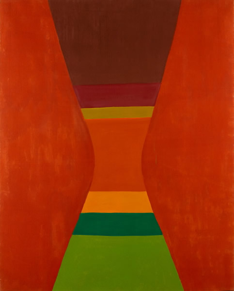
| Pinched Orange, 1964 |
There's something admirably unromantic about the way it plays out, divorced from any grandness, with the painter puttering through the mechanical logic of his graduating shifts in style. This would be alarmingly smooth if there weren't a few caveats dropped in, albeit with little approaching curatorial comment. These come in the form of two, relatively small, rooms. One contains his early paintings. These are a mixture of generic art school compositions, Group of Seven influenced (though more naturalized and solid in the Charles Comfort vein) landscapes, flirtations with the sort of expressionistic urban interiors of shadows and broken windows that populated Montreal in 30s and 40s. There's a bit of crafty non-identity to it all and the cramped room makes it seem more anonymous. There's also a charm to this. What's more instructive, however, is the larger, darker room next to it. This displays his graphic design work and his preparatory sketches and it is here that what's at stake in his development is underlined. I'm sure someone could write a PHD thesis about the relationship between the pictorial imagination of Chatelaine readers and fans of colour field painting (from Greenberg to Andy Williams), but I'm not about to. The visual language of the lifestyle editorial is clearly carried on in his paintings, dumbed down and brutalized a little. The strange thing is that these two rooms appear near the end of the exhibit, but not quite, shoved to the edge like they are some kind of return of the repressed before his paintings suddenly become far more texture heavy.
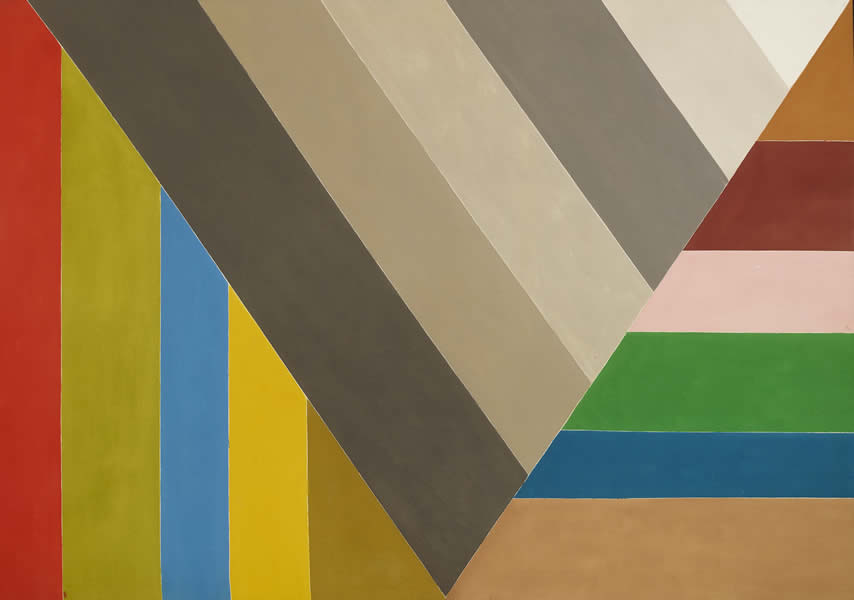 |
| Grey V, 1967 |
The sense of Bush's presence is played up in the display. We get the banality of working, with wall texts by the paintings taken from his diaries. Lines approximating I painted this before breakfast and thought it bad but the wife walked in with a cabbage and told me to leave it alone tend to predominate. This sort of mental processing is also put in more austere terms thanks to the row of journals that run along a wall. Closed and unreadable, their semi-secret banality an echo to the paintings. I couldn't ascertain exactly how other viewers were reacting to this. It was Boxing Day so no one was really themselves. Although, I suppose that being grouchy and hungover may be the optimal way to look at Bush paintings.
I've suffered the misfortune of being exposed to Bush's work mostly through reproductions, which can come nowhere close to the calculated crudeness that they often display. The works from the early 60s, still generally in oil, are particularly crude, deliberately unpolished, or rather, topped off with the look of the unpolished. By the mid-sixties he had moved mostly into acrylic and was exploring the advantages of taping. But it isn't just flatness they gain but a sense of the illustrated. That said, and more strikingly for it, there's remarkably little sense of drawing in Bush's work. Even in his preparatory sketches there is something more mechanical at play. There's an overdetermined lightness of touch for a few years in his career. This lightness then turns to hovering. You get suspended tasches on surfaces that look increasingly busy; busy though never frenzied: there's a sedated quality to his work in the 70s. Some of this is fascinating, resulting in fake marble type effects, accents that sometimes resemble crayon rubbings played off against little scads of whitish-grey. There's an airiness that he creates for his flat plumes of colour suspended over his fluttering non-patterns. These get close to Rococo excess gone amok at times and run in two odd directions. As you hit the end of the show, one side of the work seems funerary, exhausted. What came before suddenly registers as a spasm. The other becomes almost decorative. More like the backgrounds to children's books.
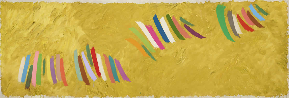 |
| Chopsticks, 1977 |
No comments:
Post a Comment